Digital art and surface pattern design by Adobe Illustrator.
UX Research
Key Problems
1. People don’t have time to shop.
2. It’s hard to show little gestures if people live at a distance.
3. Sending a gift card is great but could look less thoughtful and personal.
Goal
1. The app should be simple and easy to use
2. The users can find the receiver’s local businesses that issue gift cards
3. The users can select either an e-gift card or a printed gift card, and set a date for when
the e-gift card gets sent with the option of sending a message for a personal touch.
The 5Ws
Who Busy professionals in the ’20s to ’50s.
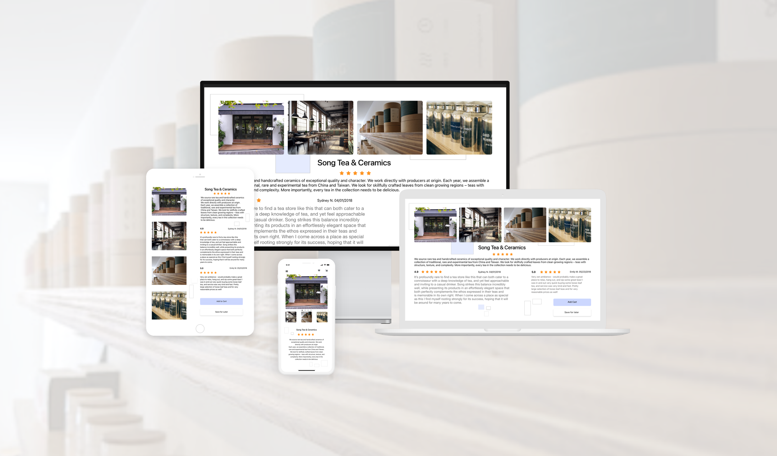
What A responsive website, web app, and mobile app that shows users to purchase
gift cards from local businesses.
When This product can be used anytime and anywhere when the user thinks of
someone and wants to send a little something
Where Users can easily shop anywhere they can connect to the internet, whether on a
mobile or desktop.
Why Even if the users thought of sending a gift, they could get caught up with their
busy lives and don’t have time to go to shops or browse websites to find
something, or they end up purchasing gift cards from big chains which could lack
personal touch. This app has shops that offer gift cards from small businesses to
choose from. Once you open the app, you have options that are nicely curated for
your needs.
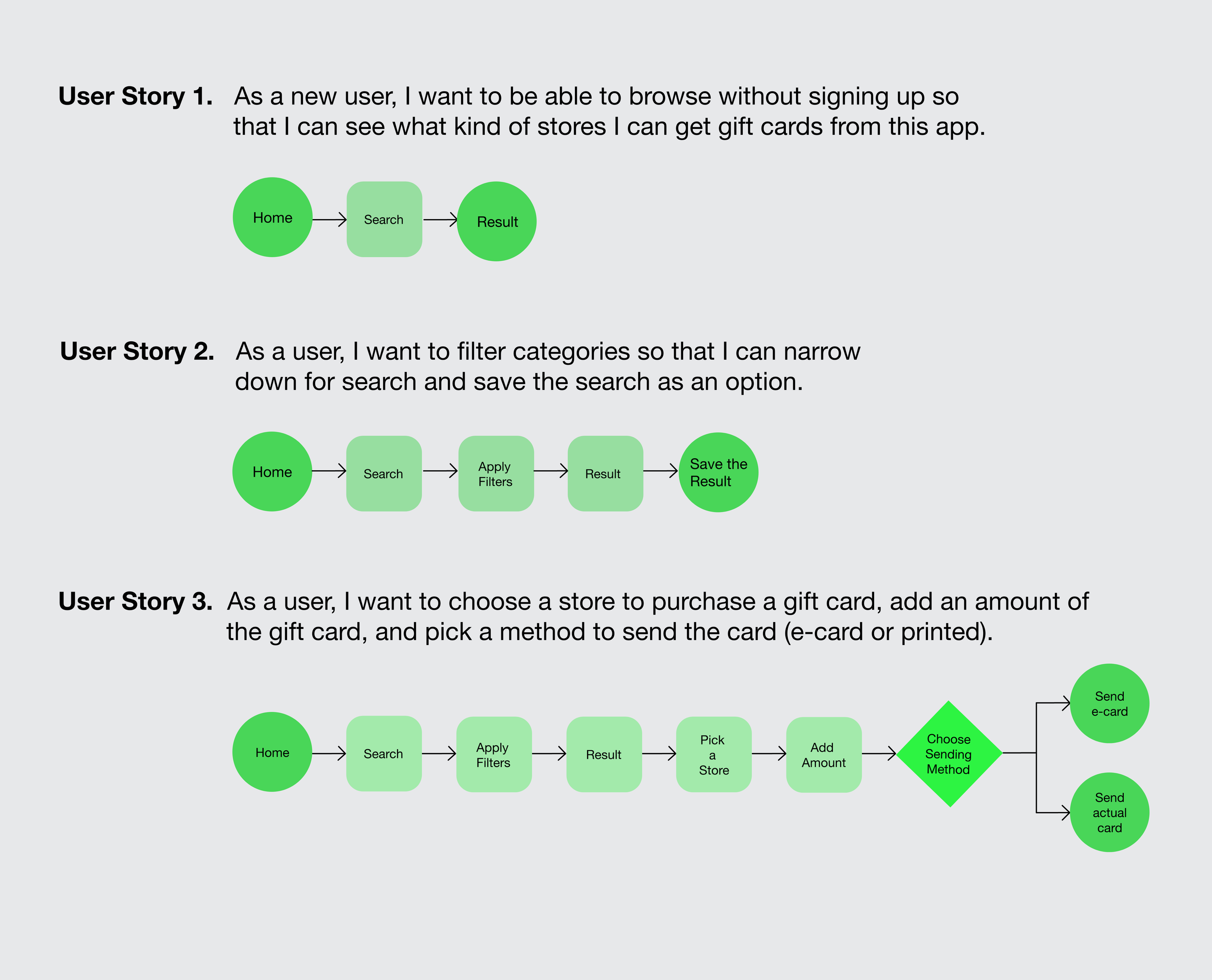
User Flow Diagram
Designing a logo
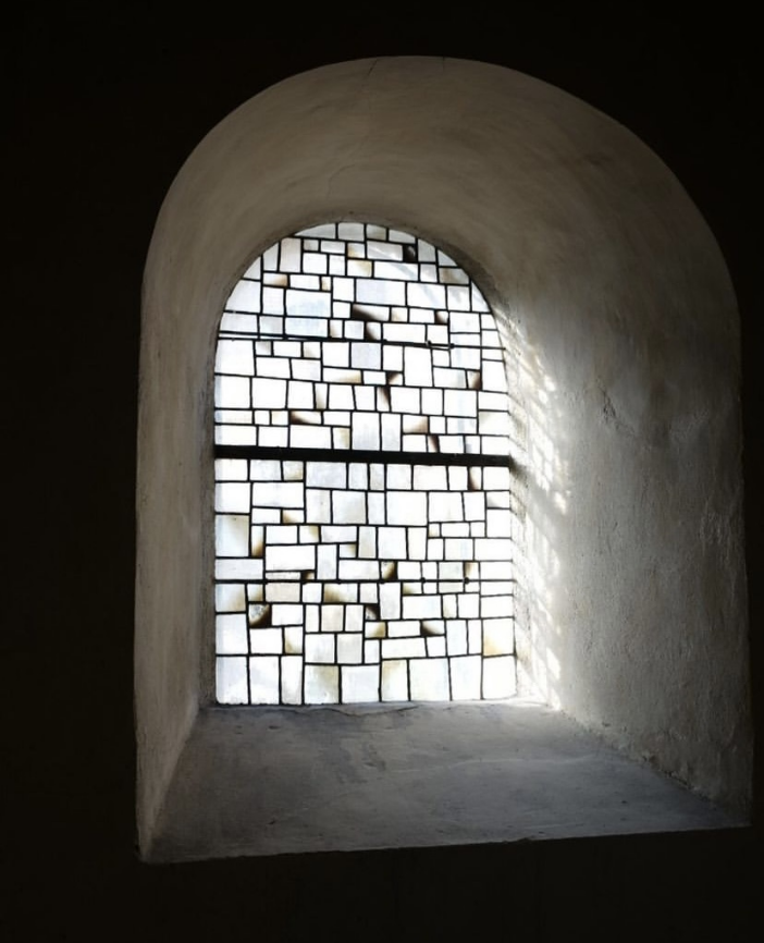
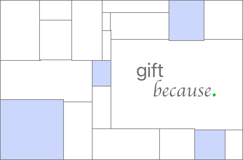
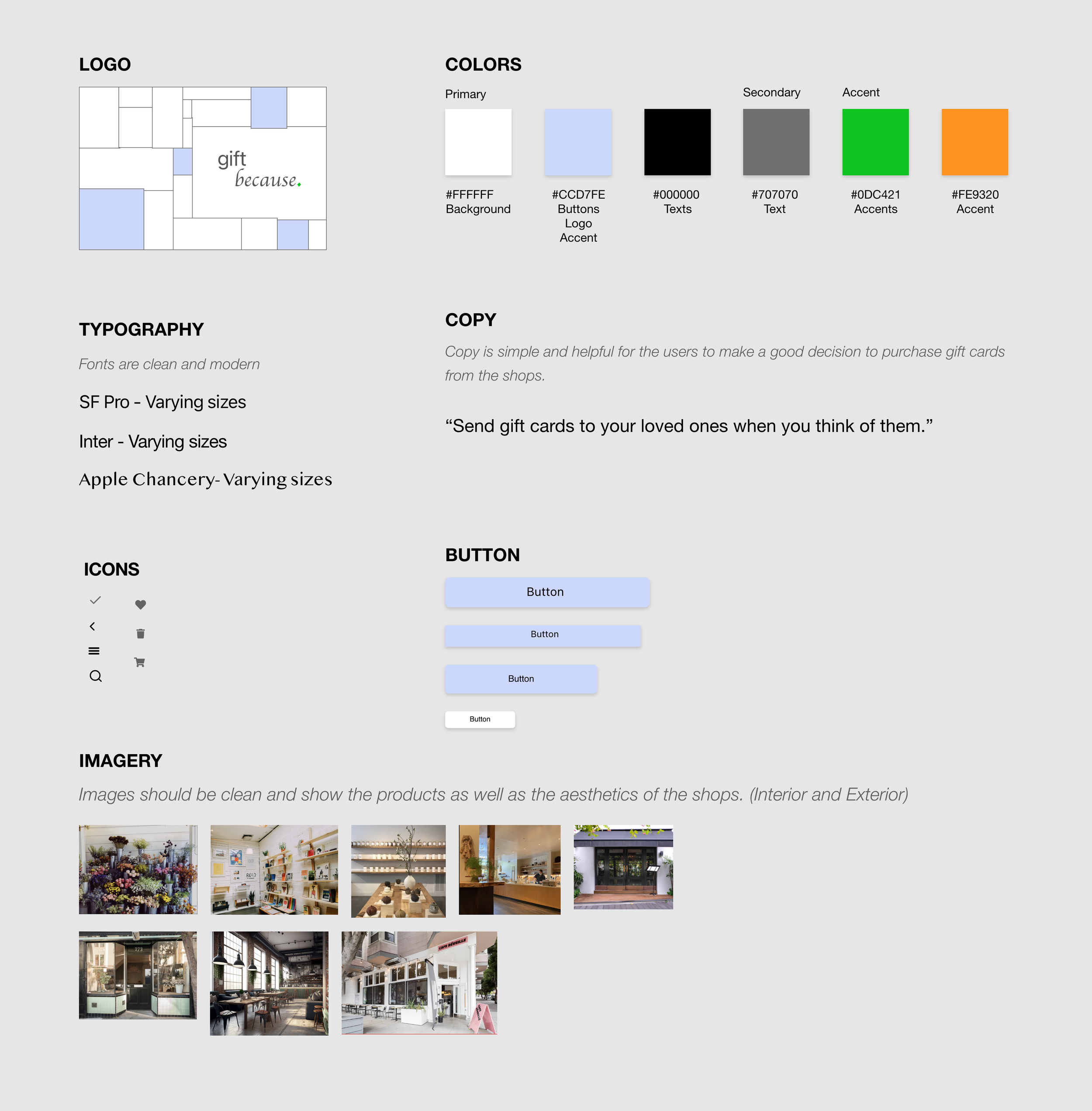
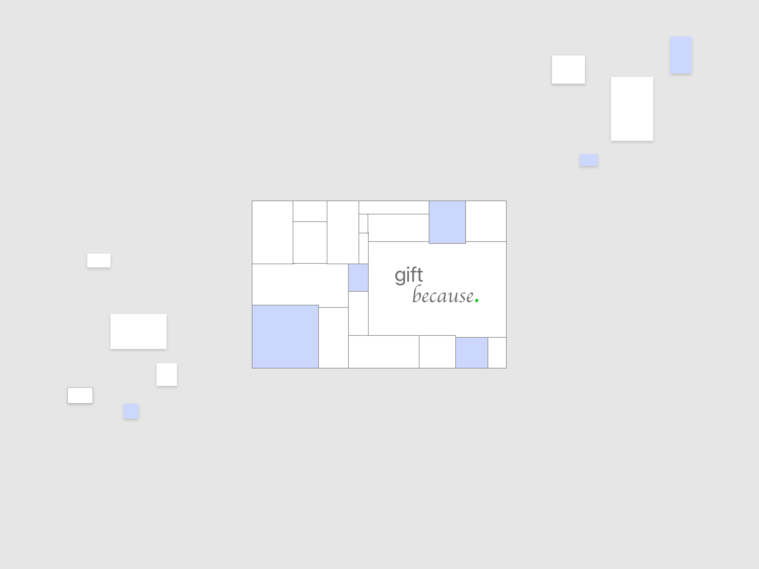
I came up with the idea for the logo first. I liked the image of the window on Hans Verstuyft Architecten Instagram account. When I thought of making a logo for a gift card, it popped into my mind. Each rectangle is an abstract version of a gift card, and the organic shapes show warmth while the colors keep the design clean.
An image of a window from Hans Verstuyft Architecten Instagram account.
gift because. logo
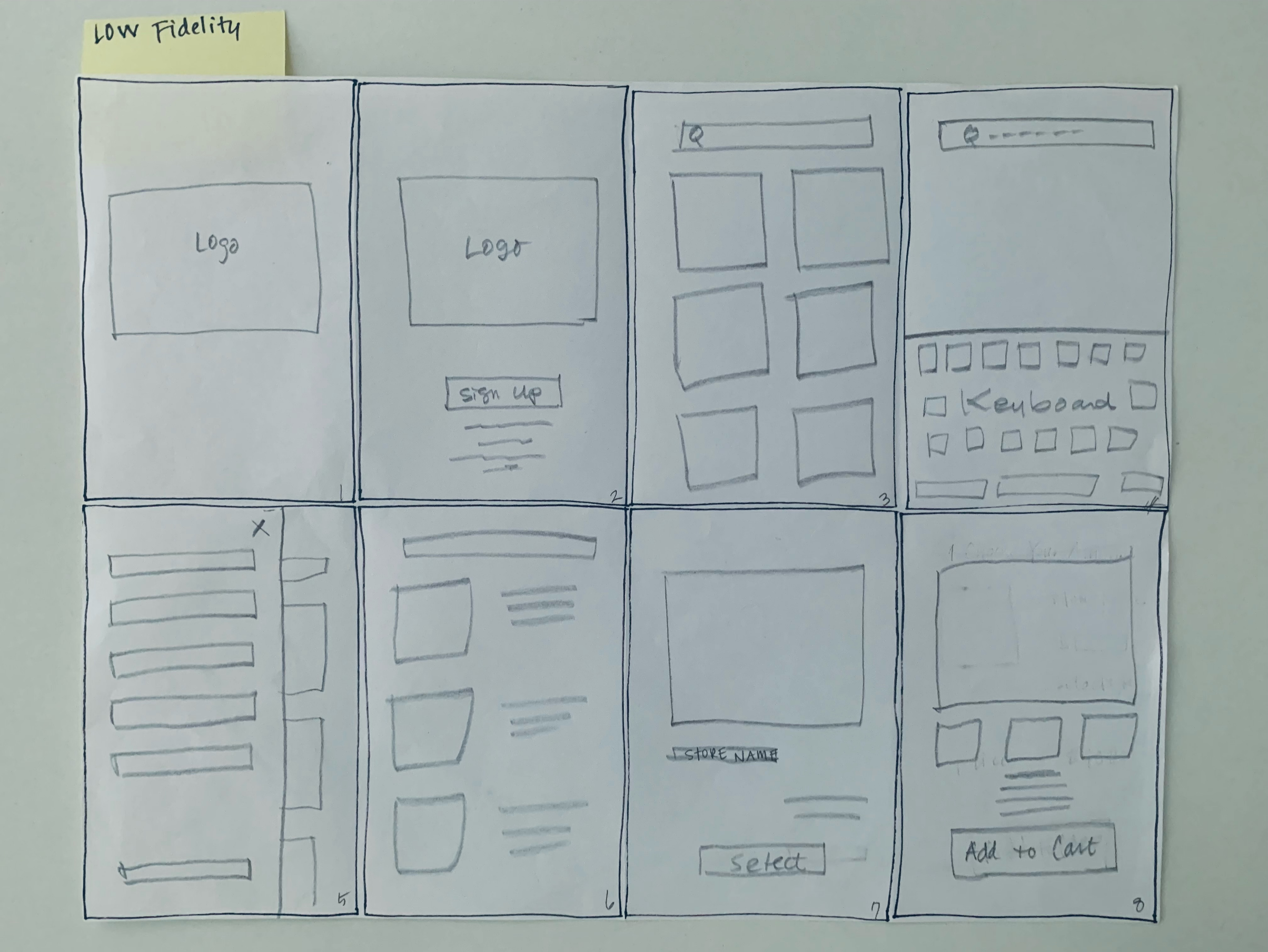
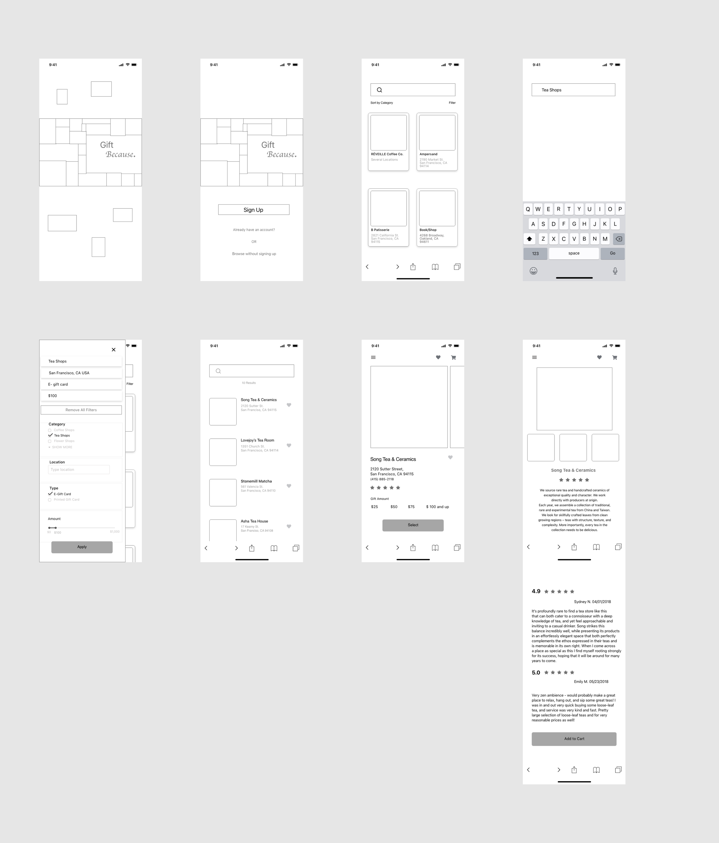
Low Fidelity Wireframe
I sketched Low Fidelity Wireframe and tried to use rectangles throughout the pages like the logo.
Mid Fidelity Wireframe
Based on Mid Fidelity, I developed High Fidelity and showed them to people.
Below is some feedback I received for the original High Fidelity Wireframe and updated them.
User Testing Analysis and Feedback
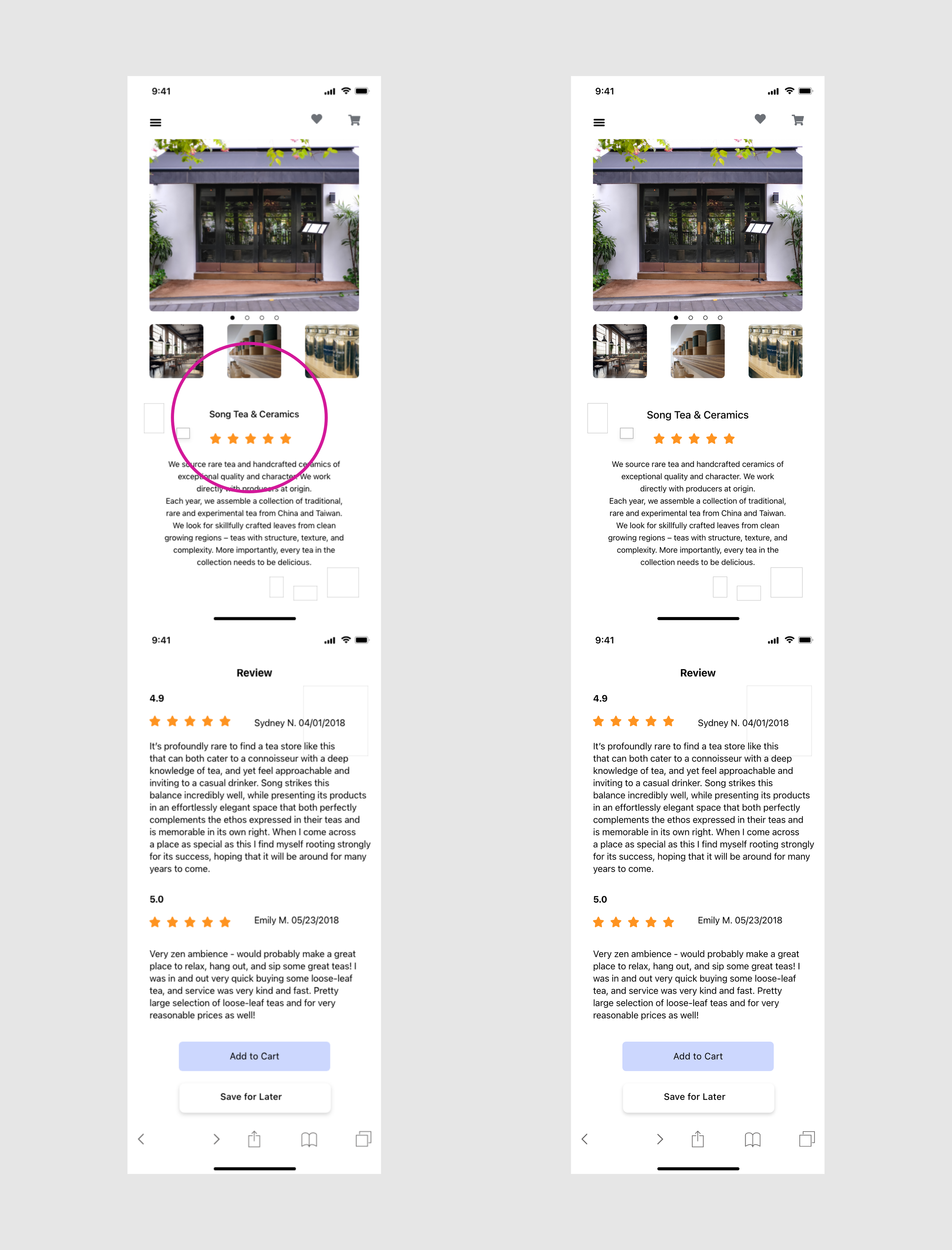
Feedback 1: The shop name could be bigger so easy to see.
Solution: Changed the font size from 15 px to 17 px Medium so that it is larger but
keeps the calm design.
BEFORE AFTER
Feedback 2: Editing the date to send the card should be a button instead of an icon.
Solution: Added button “Change Date” instead of the icon
BEFORE AFTER
Feedback 3: The button “Proceed” seemed like there would be another page after this page.
Solution: Change the button to say “ Confirm.”
BEFORE AFTER

